Adding menu choices
With the menu bar complete, the next step is to add the pull-down menu choices that will be attached to each. For the choices on the pull-down menu you can use any of the following parts in the Menus Category:

Use a Menu Choice part when you need a simple menu choice.

Use a Menu Toggle part when you want to display a check mark on a menu choice to indicate a particular application state associated with the choice.

Use a Menu Cascade part when you want a menu choice to display another menu. The use of cascades will help you group menu choices and simplify your user interface

Use the Separator part to add a line that visibly separates groups of menu choices. The separator is not a menu choice itself but is just used to separate the menu elements.
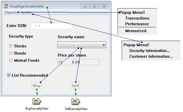
Now, let's add some menu choices to our menu bar. For the Investment application, we need to add three menu choices, a cascaded menu, a separator to the Reports menu and two menu choices to the Update menu.
Add a menu choice
1. Because we are going to add multiple copies of the same part, select Sticky from the parts palette.
2. From the Menus category

, add three Menu Choice parts

to the pop-up menu connected to the Reports menu bar item. You'll add them as follows:

, add three Menu Choice parts

to the pop-up menu connected to the Reports menu bar item. You'll add them as follows:
a. Select the Menu Choice part from the palette and drop it onto the part labeled Popup Menu1. This will add a new Menu Choice part named Menu Choice1.
b. Since the mouse pointer is still loaded, simply click mouse button 1 on the menu part labeled Menu Choice1 that you just added. This will add a new Menu Choice part named Menu Choice2.
c. Repeat the same process to add your third Menu Choice. It will be labeled Menu Choice3.
1. Once your choices are added, directly edit the text of these parts to be Transactions, Performance, and Memorized.
3. Add a Separator part

between the second and third Menu Choice parts. Notice that the part is added to the menu at the position where you click the mouse.

between the second and third Menu Choice parts. Notice that the part is added to the menu at the position where you click the mouse.
For Windows:
You can change the position of a Menu Choice, Separator part or Menu Cascade part by dragging the part to a new location within the Pop-up Menu part.
4. Now, let's add two Menu Choice parts to the pop-up menu connected to the Update menu bar item. Once they are added, direct edit the text of the menu choices to Security information... and Customer information...
5. Save the part.
The Investment application's window and menu bar should now look as follows:


Adding a cascade menu
Let's add a Cascade Menu part to the Reports menu. You can add cascaded menus within menus and cascade multiple levels deep. Building cascaded menus is just like adding a Menu Bar Item part. Let's add a Separator part followed by a Cascade part.
1. From the Menu category 
select a Separator part

and add it following the Memorized choice on the Reports menu.

select a Separator part

and add it following the Memorized choice on the Reports menu.
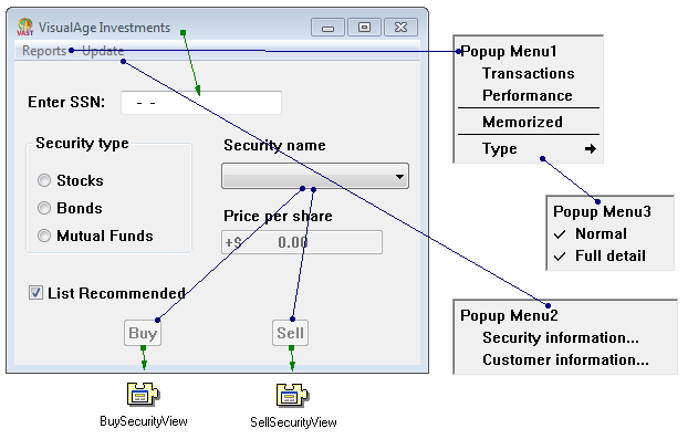
2. Now, add the Menu Cascade part following the Separator part and change its label text to Type. A new pop-up menu is created automatically and connected to the Menu Cascade part.
Note:
If you place the Cascade part in the wrong place in the menu simply select it and drag it to its correct location.
3. To specify the choices in the cascaded menu, add two Menu Toggle parts

to the pop-up menu for the Menu Cascade part. Then, directly edit these menu choice parts to be Normal and Full detail respectively.

to the pop-up menu for the Menu Cascade part. Then, directly edit these menu choice parts to be Normal and Full detail respectively.
4. Open the Properties window for the Normal Menu Toggle part and change the value of the selection property to true by selecting the value cell and selecting the true button. Then, select OK to save your changes.
5. From the File pull-down menu of the Composition Editor, select Save part. Close the Composition Editor and save your image.
The Investment application's window and menu bar should now look as follows:


Menu part distinctions
The differentiation between the two types of menus, Menu Bar and Pop-up Menu, is artificial. A Menu Bar part and a Pop-up Menu part are the exact same part under the covers. Try it for yourself by dropping each onto the free-form surface of the Composition Editor and you'll see that they are both Pop-up Menu parts.
If you compare the Menu Bar Item part and the Menu Cascade part in the same way you'll see that they are also the same; they are both Cascade Buttons. Even the Menu Choice part is not unique, it's just a push button in disguise, the same one found in the Buttons Category.
And yes, the Menu Toggle part is really just a Toggle Button part. This seeming duplication is provided to help beginners separate the ideas of Menu Bars from Pop-up Menus as well as to keep you from jumping between categories when you are building menus. Don't be confused. Experiment until you are comfortable with the use of the various menu parts.
Now save your work. From the File pull-down menu of the Composition Editor, select Save part then, close the Composition Editor and save your image using the File>Save Image option in the Organizer.
Congratulations! You have completely built a menu bar for your Investment application!
Last modified date: 05/11/2020