Adding menu parts
In VA Smalltalk, you can build two basic types of menus. You can build a menu bar that is attached to a window and you can build pop-up menus that are displayed on demand from parts such as lists, forms, notebooks and container parts. Both types of menus are constructed from similar menu parts and provide the same basic capabilities.
Menu Bars
A menu bar is displayed across the top of a window and provides the user with a set of choices that are used to access actions performed from the window. A menu bar can be made up of various menu elements but must contain at least one Menu Bar Item part which is added for you by default. The Menu Bar

and Menu Bar Item parts

are located in the Menus Category

of the Composition Editor parts palette.

and Menu Bar Item parts

are located in the Menus Category

of the Composition Editor parts palette.
Pop-up Menu parts
A pop-up menu can be used with all types of lists or form parts. Pop-up menus are displayed on demand from parts like lists, forms, notebooks and container parts. When Pop-up Menus are enabled for a part, the pop-up is displayed when a user clicks the appropriate mouse button over the enabled part.
Note:
For Windows use mouse button 2 to display a pop-up menu, for any UNIX platform, use mouse button 3.
Pop-up menus provide the user with a set of actions that can be performed for the particular part. You build a pop-up menu by placing a Pop-up Menu part

on the free-form surface and connecting its self attribute to the menu attribute of the part for which you want it to become the pop-up menu, a List part for instance. You add a Menu Choice part to the Pop-up Menu to create the menu choices. To add a menu choice to a pop-up just select the Menu Choice part

and drop it on the Pop-up Menu part located on the free-form surface. The connection is made for you automatically.

on the free-form surface and connecting its self attribute to the menu attribute of the part for which you want it to become the pop-up menu, a List part for instance. You add a Menu Choice part to the Pop-up Menu to create the menu choices. To add a menu choice to a pop-up just select the Menu Choice part

and drop it on the Pop-up Menu part located on the free-form surface. The connection is made for you automatically.
Cascade Menus
A cascaded menu is a type of menu choice you can add to either a menu bar item or a pop-up menu. It provides a way to group common menu choices together under one choice that is named to distinguish a group or category of common menu choices. The action performed by the Cascade Menu part is to display its cascading menu choices. For instance, let's say you must provide three save choices; Save, Save As..., and Save All. You could group all three together under one Save... Cascade Menu part. You build a cascaded menu by adding a Menu Cascade part

as a menu choice in an existing Menu bar item or a pop-up menu item. When you add a Menu Cascade part, a pop-up menu is automatically connected for your use.

as a menu choice in an existing Menu bar item or a pop-up menu item. When you add a Menu Cascade part, a pop-up menu is automatically connected for your use.
For the Investment application, we will build a menu bar that contains a cascaded menu as one of its menu choices.
Creating a menu bar
Let's add a Menu Bar and some Menu Item parts to our investment application.
1. Open the Composition Editor for the MainWindowView visual part.
2. From the Menus category

, select the Menu Bar part

and drop it on any open area of the Window part.

, select the Menu Bar part

and drop it on any open area of the Window part.
A Menu Bar is added along with the first Menu Bar Item, its associated Pop-up Menu and the proper connections. Now, let's create a second pull-down menu by adding another Menu Bar Item.
3. From the Menus category

, select the Menu Bar Item part

and add it to the menu by dropping it onto the Menu Bar part you just added.

, select the Menu Bar Item part

and add it to the menu by dropping it onto the Menu Bar part you just added.
The Menu Bar Item part is created along with its associated pop-up menu and connections.
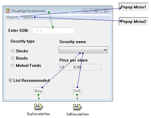
4. Directly edit the first Menu Bar Item part's text to Reports and the second Menu Bar Item part's text to Update.
You might want to move the pop-up menus that are automatically added and connected to the menu bar items so that the free-form surface is not as cluttered.
Your window with its menu bar should look as follows:


Last modified date: 03/26/2020