Status bars provide an area, usually located along the bottom of a window, for an application to provide status information. A status bar can be divided up into a number of status panels. The appearance of status panels within status bars can be tailored by setting their shadow property. Using this property, you can have the entire status bar appear flat, "indented", or "outdented", similar to a push button.
|
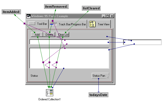
1.
|
From the composition editor, add a Status Bar to the bottom of the Tool Bar Tab page. Size it so that it stretches across the width of the page.
|
|
2.
|
Add two Status Panel parts to the status bar. Change the name of the first to Status. Size the first to fill most of the status panel.
|
|
3.
|
Open the settings of the left status panel. Change it's shadowType to XmSHADOWIN. This will cause it to appear "indented".
|
|
4.
|
Open the settings of the right status panel. Change it's shadowType to XmSHADOWOUT. This will cause it to appear "outdented".
|
Move back to the Composition Editor and create an attribute-from-script connection from the labelString attribute of the right status panel to todaysDate.
There are a number of approaches we can use to set the status text in the Status status panel. We're going to use a simpler approach instead of one that may be more extensible.
|
•
|
|
•
|
|
•
|
|
•
|
Connect the object attribute of the Text part to the parameter of the clicked-itemAdded: connection.
|
|
•
|
Connect the selectedItem attribute of the List part to the parameter of the clicked-itemRemoved: connection.
|
If you use a status bar across the bottom of a window, as in many Windows applications, you can modify its attachment settings to attach it to the left, right, and bottom of its parent with a 0 offset. Making these attachments provides behavior consistent with many other Windows applications. Status panels also implement a recomputeSize action. Using this action causes a status panel to be resized based on the length of the text contained in it.