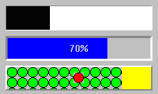
HorizontalBarGaugeView


The WkHorizontalBarGauageView part provides a visual indication of a magnitude within a given range. It can be used to represent such values as the amount of gas left in a gas tank, or the remaining balance in a bank account. It is also often used to indicate the amount of time spent/remaining on a long compute-bound processing task, such as reading a file or sorting a list.
The gauges provided in WidgetKit/Controls can either be rectangular or circular. The rectangular versions, WkHorizontalBarGaugeView and WkVerticalBarGaugeView, show a rectangular bar to indicate the current value of the gauge (increasing to the right and upwards, respectively). The WkCircularGaugeView fills the wedge of a circle to indicate its value.
The direction of the progress can be specified (left-right or right-left). The size of the progress bar’s completion indication is controlled by the value, minimum and maximum resources. The progress bar’s completion indication can either be a color (foregroundColor resource) or any renderable image (such as an icon or bitmap -- ribbonImage resource). The uncompleted progress indication is a color (backgroundColor resource). A label can be drawn centered in the progress bar. This can either be a percentage complete (value / (max - min)), displayed automatically by the progress bar (howPercentage resource), or any defined renderable image as the label (image resource).
Protocol
direction: anInteger
Specifies the direction the progress bar moves in.
Specifies the direction the progress bar moves in.
Default: XmFORWARD (Forward)
Valid resource values:
XmFORWARD (Forward) - The progress bar moves forward. For horizontal progress bars, this is left-to-right. For vertical progress bars, this is top-to-bottom.
XmREVERSE (Reverse) - The progress bar moves backwards. For horizontal progress bars, this is right-to-left. For vertical progress bars, this is bottom-to-top.
gaugeStyle: anInteger
Specifies the gauge's gauge style.
Specifies the gauge's gauge style.
Default: XmSOLID (Solid)
Valid resource values:
XmSTEP (Step) - The gauge is drawn in discrete steps (Win95 style).
XmSOLID (Solid) - The gauge is drawn as a solid bar.
graphicsDescriptor: aGraphicsDescriptor
Specifies the graphics descriptor which draws as the label of the progress bar. The label is displayed only if the showPercentage resource value is false. Note that the image label is drawn twice, in the foreground and background colors, so that the label appears ‘reversed’ over the actual foreground and background colors of the progress bar. If a ribbon image is being used, then the label is drawn once, using the foreground color.
Specifies the graphics descriptor which draws as the label of the progress bar. The label is displayed only if the showPercentage resource value is false. Note that the image label is drawn twice, in the foreground and background colors, so that the label appears ‘reversed’ over the actual foreground and background colors of the progress bar. If a ribbon image is being used, then the label is drawn once, using the foreground color.
maximum: anInteger
Specifies the gauge's maximum value.
Specifies the gauge's maximum value.
minimum: anInteger
Specifies the gauge's minimum value.
Specifies the gauge's minimum value.
ribbonGraphicsDescriptor: aGraphicsDescriptor
Specifies the graphics descriptor which draws as the completed ribbon of the progress bar. This object is drawn instead of a color strip. Note that when a ribbon image is used, a label (the showPercentage or image resources) will be drawn using the imageColor resource, or if that is nil, the foregroundColor resource.
Specifies the graphics descriptor which draws as the completed ribbon of the progress bar. This object is drawn instead of a color strip. Note that when a ribbon image is used, a label (the showPercentage or image resources) will be drawn using the imageColor resource, or if that is nil, the foregroundColor resource.
shadowType: anInteger
Specifies the drawing style for the frame around the progress bar widget.
Specifies the drawing style for the frame around the progress bar widget.
Default: XmSHADOWIN (Shadow In)
Valid resource values:
XmSHADOWNONE (Shadow None) - No frame is drawn.
XmSHADOWIN (Shadow In) - Draws a frame such that it appears inset. This means that the bottom shadow visuals and top shadow visuals are reversed.
XmSHADOWOUT (Shadow Out) - Draws a frame such that it appears outset.
shadowWidth: anInteger
Specifies the width for the border
Specifies the width for the border
showPercentage: aBoolean
Specifies the whether a label showing the percentage completed is shown in the progress bar. If true, then the string ‘X %’ is show in the progress bar, where X is the percentage of progress completed. If false, then no percentage label is shown.
Specifies the whether a label showing the percentage completed is shown in the progress bar. If true, then the string ‘X %’ is show in the progress bar, where X is the percentage of progress completed. If false, then no percentage label is shown.
tickSize: anInteger
Specifies the gauge's tick size. Only valid when the gaugeStyle is set to step. If the value is set to zero, the widget will use the default setting (determined by the size of the widget).
Specifies the gauge's tick size. Only valid when the gaugeStyle is set to step. If the value is set to zero, the widget will use the default setting (determined by the size of the widget).
value: anInteger
Specifies the gauge's position between minimum and maximum.
Specifies the gauge's position between minimum and maximum.
Last modified date: 11/19/2018