Building the visual part
Now that you've survived building the reusable parts, let's put them to work in a view that has a left-hand window as CardDeck and a right-hand window as Discard. Create a new visual part called PlayingCardDeckListView in your CardGameApp.
Creating the user interface
In the Composition Editor view of your new visual part add another window part and add a Multiple Select List to each of the window parts. Attach each edge of the lists to the corresponding edge of the parent as follows:
1. Open the settings for the list.
2. Select the framingSpec property in the Name column and the ... button in the Value column.
3. In the Framing Spec window, select the Top radio button.
a. Select XmATTACHFORM for Attachment type.
b. Enter 0 for Offset.
Repeat these two steps, specifying XmATTACHFORM and 0 for the Bottom, Left, and Right radio buttons.
4. Select OK in the Framing Spec window and close the Properties window.
Repeat the above steps for the other list.
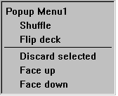
Add a Pop-up menu part to the free form surface. Add Menu Choice parts and a Separator part and change their labels so that the menu looks like this:


Connect the menu attribute of the Multiple Select List part of the left-ahd window to the self attribute of the pop-up menu.
Adding the reusable parts
Add a PlayingCardDeck part that will be used to hold the initial card deck by doing the following:
1. Select Add Part from the Options menu.
2. In the Add part window, enter PlayingCardDeck for the class name.
3. Select OK.
4. Click the mouse pointer on an empty area of the free-form surface.
Add a CardDeck part to create an empty card deck to use as as discard deck by doing the following:
1. Select Add Part from the Options menu.
2. In the Add part window, enter CardDeck for the class name.
3. Select OK.
4. Click the mouse pointer on an empty area of the free-form surface.
5. Change the name of the CardDeck to Discard.
Completing the connections
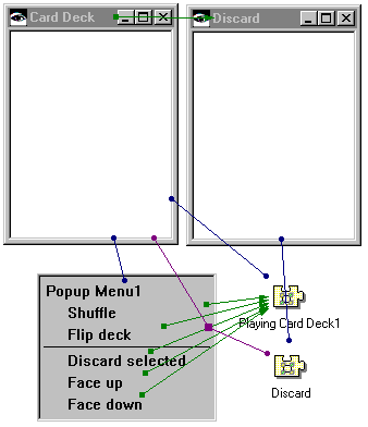
Complete the connections as follows:
•Connect the items attribute of the list part in the left-hand window part to the deck attribute of the PlayingCardDeck part.
•Connect the items attribute of the list part in the right-hand window part to the deck attribute of the Discard CardDeck part.
•Connect the clicked event of the Shuffle menu item to the shuffle action of the PlayingCardDeck part.
•Connect the clicked event of the Flip deck menu item to the flip action of the PlayingCardDeck part.
•Connect the clicked event of the Face up menu item to the faceUp attribute of the PlayingCardDeck part. Open the settings of the connection you just created. Select the Set parameters push button. In the Constant Parameter Value Settings window, select value in the Name column and true in the Value column, then select OK. Select OK in the Event-to-action connection window.
•Connect the clicked event of the Face down menu item to the faceUp attribute of the PlayingCardDeck part. Open the settings of the connection you just created. Select the Set parameters push button. Select value in the Name column and false in the Value column, then select OK. Select OK in the Event-to-action connection window.
•Connect the clicked event of the Discard selected menu item to the moveCards:to: action of the PlayingCardDeck part. Connect the selectedItems attribute of the left-hand list to the anOrderedCollection parameter of the connection you just created. Connect the self attribute of the Discard CardDeck part to the aCardDeck parameter of the first connection you created in this step.
•Connect the openedWidget event of the left-hand Window part to the openWidget action of the right-hand Window part.
Your connections should look like this in the Composition Editor.


Selecting the attribute to display
Now that the connections are complete we must select which attribute of the Card part we want to display in the list. Whenever a list part needs to repaint itself it displays this attribute for every object in the list. For our purposes we will use the fullName attribute of the Card part.
Open the settings for one of the list parts. Enter fullName for the attributeName property. Repeat these same steps for the other list.
Testing the visual part
Save your visual part and then select  to test it. Try flipping the deck, turning it face-up and face-down. Try shuffling the deck while it's face-up. Flip the deck twice. The cards should be in the same order. Select several discontiguous cards from the list. Select Discard selected from the pop-up menu. The cards should be removed from the list and placed in the Discard list.
 to test it. Try flipping the deck, turning it face-up and face-down. Try shuffling the deck while it's face-up. Flip the deck twice. The cards should be in the same order. Select several discontiguous cards from the list. Select Discard selected from the pop-up menu. The cards should be removed from the list and placed in the Discard list.
 If you do not get the expected results from these tests, review the methods you implemented in the reusable parts to make sure they are correct. You should review the connections as well.
Last modified date: 06/11/2018