Progress bar widget
Progress bar widgets (EwProgressBar) reflect the current status of an application task. The status is displayed as a percentage of the task that is complete. A horizontal or vertical bar is periodically updated by the application to indicate the progress of a particular task.
Progress is demonstrated visually by filling the progress bar with the widget's foreground color or by displaying a specified ribbonImage. The application is responsible for periodically updating the fractionComplete resource to indicate the extent to which the task has been completed.
Resources are provided which allow the application to control the visual appearance of the progress bar widget.
The orientation of the progress bar is specified using the orientation resource. The direction resource is used to determine which way the bar is filled in. For example, a progress bar with a vertical orientation and forward direction will fill in from the top to the bottom.
The shadowType and shadowWidth resources allow shadows around the bar to be specified, while the size of the bar itself within the widget can be specified using the innerHeight and innerWidth resources. The application may also use the showPercentage and fontList resources to specify a percentage complete label and its associated font.
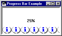
The following method creates a progress bar with a thick shadow that fills in from the bottom to the top. The Motif information icon is used to fill in the bar. The percentage complete is shown in the bar using the default font. Add this method to a class that uses the pool dictionaries CwConstants and EwConstants.
progressBarExample
| progressBar shell |
shell := CwTopLevelShell
createApplicationShell: 'shell'
argBlock: [:w | w
title: 'Progress Bar Example';
width: 210;
height: 100].
progressBar := shell
createProgressBar: 'progressBar'
argBlock: [:w | w
orientation: XmVERTICAL;
direction: XmREVERSE;
ribbonImage: (CgScreen default
getIcon: 'default_xm_information'
foregroundColor: CgRGBColor black);
shadowType: XmSHADOWIN;
shadowWidth: 5;
fractionComplete: 1/4;
showPercentage: true].
progressBar manageChild.
shell realizeWidget.
When you run the method by evaluating <class name> new progressBarExample, you get the following:


Last modified date: 12/21/2017