Icon list widgets
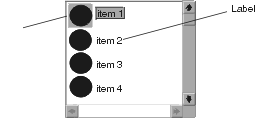
An icon list widget (EwIconList) displays each of the items in its list as a labelled icon. Following is an example of an icon list widget:


The application hooks the visualInfoCallback to specify the label and icon for each object in the list. Typically, an application provides both an icon and a string in this callback. However, either value can be set to nil if only the icon or label is desired.
Tip:
If your application requires a view with either an icon or label per item, but not both, set the icon to nil, and the label to the desired visual object for each item in the visualInfoCallback callData. Set the labelOrientation resource of the widget to XmRIGHT (default), and set the emphasisPolicy resource of the widget to XmTOGETHER.
In the following example, a list of classes is added to an icon list. The class name is used as the label of each item, and each item in the list displays the same icon.
Object subclass: #IconListExample
instanceVariableNames: 'icon'
classVariableNames: "
poolDictionaries: 'CwConstants EwConstants'
open
| iconList shell |
shell := CwTopLevelShell
createApplicationShell: 'shell'
argBlock: [:w | w title: 'Icon List Example'].
iconList := shell
createScrolledIconList: 'iconList'
argBlock: [:w | w items: Object subclasses].
iconList
addCallback: XmNvisualInfoCallback
receiver: self
selector: #visualInfo:clientData:callData:
clientData: nil.
shell
addCallback: XmNdestroyCallback
receiver: self
selector: #destroy:clientData:callData:
clientData: nil.
icon := shell screen
getIcon: 'default_xm_information' foregroundColor: CgRGBColor black.
iconList manageChild.
shell realizeWidget.
visualInfo: widget clientData: clientData callData: callData
"Provide the icon and label for the class contained in the callData."
callData
label: callData item name;
icon: icon
destroy: shellWidget clientData: clientData callData: callData
"Free the icon resource."
shellWidget screen destroyIcon: icon
Last modified date: 12/21/2017