Part Encyclopedia : WkImageWidgetView

WkImageWidgetView
WkImageWidgetViews provide a mechanism for displaying an image with an optional label. They call their default action event when they are double clicked upon. The image and text labels may be layed out either vertically or horizontally. Different images and labels can be specified for the up state and the disabled state. An optional inset or outset border may also be specified.
Protocol
alignment: resourceValue
Sets the horizontal alignment for the widget's image.
Default: XmALIGNMENTBEGINNING (Left)
Valid resource values:
XmALIGNMENTBEGINNING (Left) - Causes the center of the image to be horizontally aligned with the left edge of the widget's window.
XmALIGNMENTCENTER (Center) - Causes the center of the image to be horizontally aligned in the center of the widget's window.
XmALIGNMENTEND (Right) - Causes the center of the image to be horizontally aligned with the right edge of the widget's window.
 
disabledGraphicsDescriptor: aGraphicsDescriptor
Specifies the graphics descriptor which draws on the face of the widget when it is disabled.
 
disabledLabelString: aString
Specifies the renderable object (string) which draws on the face of the widget when it is disabled.
 
graphicsDescriptor: aGraphicsDescriptor
Specifies the graphics descriptor which draws on the face of the widget.
 
labelString: aString
Specifies the renderable object (string) which draws on the face of the widget.
 
mnemonic: aCharacter
Provides the user with alternate means for selecting a button.
 
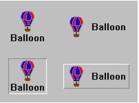
orientation: anInteger
Specifies whether the image and label are displayed vertically or horizontally.
Default: XmHORIZONTAL (Horizontal)
Valid resource values:
XmVERTICAL (Vertical) - Displays the image and label vertically.
XmHORIZONTAL (Horizontal) - Displays the image and label horizontally.
 
shadowType: anInteger
Specifies the drawing style for the frame around the label.
Default: XmSHADOWNONE (None)
Valid resource values:
XmSHADOWNONE (None) - No frame is drawn around the label.
XmSHADOWIN (In) - A frame is drawn that it appears inset. This means that the bottom shadow visuals and top shadow visuals are reversed.
XmSHADOWOUT (Out) - A frame is drawn that appears outset.
 
verticalAlignment: anInteger
Specifies the vertical alignment for the widget's image.
Default: XmALIGNMENTCENTER (Center)
Valid resource values:
XmALIGNMENTCENTER (Center) - Causes the center of the image to be vertically aligned in the center of the widget's window.
XmALIGNMENTTOP (Top) - Causes the top edge of the image to be vertically aligned with the top edge of the widget's window.
XmALIGNMENTBOTTOM (Bottom) - Causes the center of the image to be vertically aligned in the center of the widget's window.
Events
Default Action Requested
These events are triggered when the widget is double clicked.