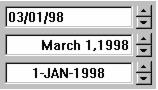
Part Encyclopedia : WkDateEditorView

WkDateEditorView
The WkDateEditorView, as its name implies, provides a convenient control for editing dates. It contains three fields for setting the month, day, and year of a date value. Since it is specifically designed for date manipulation, it assures that any date entered is guaranteed valid.
Date editors allow the user to edit a date by manipulating the month, day, and year fields as if they were each numeric editors. When a date widget receives the input focus, the first field becomes the current field. The current field can be selected by using the mouse or the left and right arrow keys. Once selected, a field (day, month, or year) can be edited using either the arrow buttons or by using the keyboard to type the value. Incrementing past the last day in a month or the last month in a year will increment the month or year.
WkDateEditorView provides a variety of styles to allow for flexibility in choosing a date format. These styles mirror the settings dialog provided by Windows, and should allow all supported cultural date variations, including changing the separator (“/” by default), switching the order of the editors, and showing leading zeros or the full century.
The contents of a WkDateEditorView is a Date object, both for setting and retrieving the current value. A user can increment or decrement the values using up/down arrow keys or by selecting the up/down buttons. A user can change the value in an editable spin button by typing in the entry field.
Protocol
alignment: anInteger
Specifies the text alignment used by the widget.
Default: XmALIGNMENTEND (Right)
Valid resource values:
XmALIGNMENTBEGINNING (Left) - Causes the left side of the line of text to be vertically aligned with the left edge of the widget window.
XmALIGNMENTCENTER (Center) - Causes the center of the line of text to be vertically aligned in the center of the widget window.
XmALIGNMENTEND (Right) - Causes the right side of the line of text to be vertically aligned with the right edge of the widget window.
 
allowNil: aBoolean
Specifies whether the text field may have a blank (nil) value.
 
date
Answers the date held by the widget.
 
date: aDate
Set the date held by the widget.
 
dayLeadingZero: aBoolean
Specifies whether the day field is displayed with a leading zero.
 
editable: aBoolean
Specifies whether a user can edit text in the entry field part of the spin button.
 
format: aSymbol
Specifies format in which the date is displayed.
Default: XmMDY (M/D/Y)
Valid resource values:
XmDM (D/M) - Day and Month only.
XmDMY (D/M/Y) - Day, Month and Year.
XmMD (M/D) - Month and Day only.
XmMDY (M/D/Y) - Month, Day and Year.
XmYDM (Y/D/M) - Year, Date and Month.
 
maximum: anInteger
Specifies a numeric spin button’s maximum value.
 
minimum: anInteger
Specifies a numeric spin button’s minimum value.
 
monthFormat: aSymbol
Specifies format in which the month is displayed.
Default: XmNUMBER (Number)
Valid resource values:
XmABBREVIATION (Abbreviated) - Abbreviated Name.
XmNUMBER (Number) - As number.
XmTEXT (Text) - Full Name.
 
monthLeadingZero: aBoolean
Specifies whether the month field is displayed with a leading zero.
 
separator: aString
Specifies the separator character(s) used to separate the date fields.
 
selectOnFocus: anInteger
Specifies which field is selected on gaining focus.
Default: XmSELECTLAST (Select Last)
Valid resource values:
XmSELECTLAST (Select Last) - Select the field that last had focus.
XmSELECTALL (Select All) - Selects all of the text of the widget.
XmSELECTDAY (Select Day) - Select the day field.
XmSELECTMONTH (Select Month) - Select the month field.
XmSELECTYEAR (Select Year) - Select the year field.
 
showCentury: aBoolean
Specifies whether the century is displayed or not.
 
value: aString
Specifies the initial value of the widget.
 
wrapAround: aBoolean
Specifies whether the spin button should cycle or stop upon reaching the end of the collection, or max or min for a numeric spin button.
Events
Activated
These events are triggered when the user presses the default action key. This is typically a carriage return.
 
Date Changed
These events are triggered when the date represented by the widget changes.
 
Decremented
These events are triggered when the user decreases the spin button value by one step. This can happen either when the down arrow key is pressed or when the down arrow button is selected with the mouse.
 
Getting Focus
These events are triggered before the entry field has accepted input focus.
 
Incremented
These events are triggered when the user increases the spin button value by one step. This can happen either when the up arrow key is pressed or the up arrow button is selected with the mouse.
 
Losing Focus
These events are triggered before the entry field loses input focus.