The prompter-based Set Size and Set Position functions are very useful and absent from the Composition Editor. The various Move and Size commands are also very useful for fine tuning a layout. Normally the Move and Size commands operate a pixel at a time. By holding the Alt key down, they will move or size the selected widgets by one grid increment (e.g., five pixels). Holding the Shift key down will make the command operate in reverse. For example, the Size commands will shrink the selected widgets away from the indicated direction.
 Set the size of the selected parts. This opens a prompter dialog in which you can specify a new size as a point.
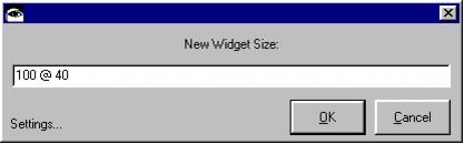
 Set the position of the selected parts. This opens a prompter dialog in which you can specify a new position as a point.
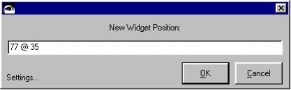
 Size the selected parts according to predefined hints. This will size a widget to the size returned by the #preferredExtent of the widget’s primaryWidget. For Labels and Buttons, the widget will size itself to comfortably contain the widgets label.
 Align the selected parts with the left edge of the last part selected (the one with the solid black handles).
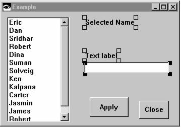
 Align the selected parts along the vertical axis of the last part selected (the one with the solid black handles).
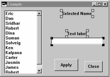
 Align the selected parts with the right edge of the last part selected (the one with the solid black handles).
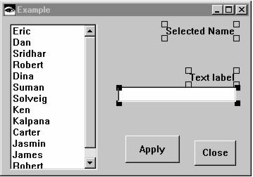
 Align the selected parts with the top edge of the last part selected (the one with the solid black handles).
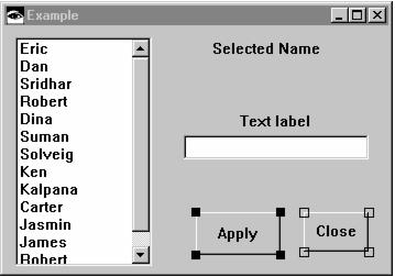
 Align the selected parts along the horizontal axis of the last part selected (the one with the solid black handles).
 Align the selected parts with the bottom edge of the last part selected (the one with the solid black handles).
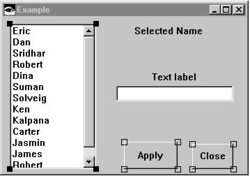
 Spaces the selected parts evenly between the left and right borders of the parent part, typically a window.
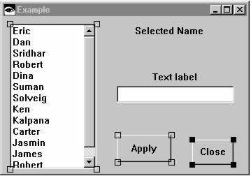
Alt-click to distribute the selected parts horizontally within their own bounding box. The bounding box is the smallest rectangle that encompasses all of the selected parts.
 Spaces the selected parts evenly between the top and bottom borders of the parent part, typically a window.
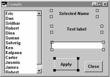
Alt-click to distribute the selected parts vertically within their own bounding box. The bounding box is the smallest rectangle that encompasses all of the selected parts.
 Sizes the width of the selected parts to match that of the last part selected (the one with the solid black handles).
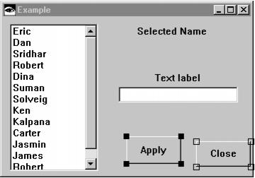
 Sizes the height of the selected parts to match that of the last part selected (the one with the solid black handles).
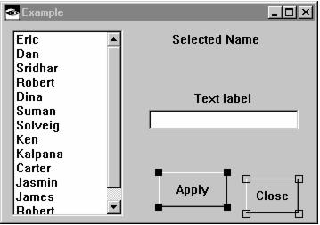
 Move the selected parts left one pixel.
 Alt-click to nudge selection left by one grid increment (e.g., five pixels).
 Move the selected parts right one pixel.
 Alt-click to nudge selection right by one grid increment (e.g., five pixels).
 Move the selected parts down one pixel.
 Alt-click to nudge selection down by one grid increment (e.g., five pixels).
 Move the selected parts up one pixel.
 Alt-click to nudge selection up by one grid increment (e.g., five pixels).
 Grow the selected parts’ width by one pixel to the left.
 Alt-click to grow the selected parts’ width by one grid increment to the left (e.g., five pixels).
Shift-click to shrink the selected parts’ width away from the left.
 Grow the selected parts’ width by one pixel to the right.
 Alt-click to grow the selected parts’ width by one grid increment to the right (e.g., five pixels).
Shift-click to shrink the selected parts’ width away from the right.
 Grow the selected parts’ height by one pixel downward.
 Alt-click to grow the selected parts’ height by one grid increment downward (e.g., five pixels).
Shift-click to shrink the selected parts’ width away from the bottom.
 Grow the selected parts’ height by one pixel upward.
 Alt-click to grow the selected parts’ height by one grid increment upward (e.g., five pixels).
Shift-click to shrink the selected parts’ width away from the top.
 Toggle the display of the grid on and off for the selected parts.
 Aligns the selected parts to the grid. This causes the upper left corner of the selected parts to be repositioned to the nearest grid coordinate. The grid does not need to be visible for this to work.
 Undo the last command. This is equivalent to the Composition Editor’s “Edit | Undo” menu command.
 Redo the last command. This is equivalent to the Composition Editor’s “Edit | Redo” menu command.