 Selection Tool. Use this button to set the Composition Editor back to selection mode. This will turn off sticky mode if it is on.
 Select all parts. Right-click for a list of part types. Selecting a part type will select all parts of that type. This is a very useful command when you need to make a style change that affects multiple widgets of a specific type.
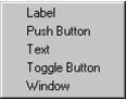
 Select all parts of the same class as the selected part. This is a very useful command when you need to make a style change that affects multiple widgets of the same type.
Alt-click to select all parts in the same class hierarchy as the selected part. For example, selecting a Label and then issuing this command will select all Labels, Buttons, Toggles and other Label subclasses.
 Set the color of the selected parts. This is equivalent to the Composition Editor’s “Options | Color...” menu command. Alt-clicking automatically invokes sticky mode.
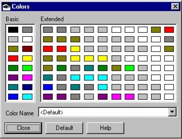
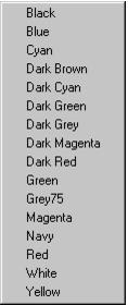
Right-click for a list of common colors. This allows you to bypass the Color selection window all together.
 Set the font of all of the selected parts at once.
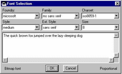
Shift-clicking on the font button opens the Font selection dialog in the same manner as the Composition Editor “Options | Fonts...” command. Selecting a font will then allow you to paint the selected font onto one or more widgets. Alt-clicking automatically invokes sticky mode.
 Set the names of the selected parts.
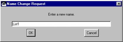
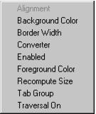
 Copy an attribute from one part to another. Clicking this button will pop up a list of attributes for the selected part. Selecting an attribute will then load the cursor with that attribute (much like the font and color painting process). You can then click on one or more widgets (if sticky mode is enabled) to “paint” that attribute onto the widget. For example, you can use this to paint the Alignment attribute from one Label to another. You could even copy Label String or Font attributes from widget to widget.
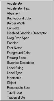
Shift-click to copy an attribute to all the selected parts.
 Open the settings view for the selected parts. This is equivalent to double-clicking on the selected part.
Alt-click to open the VA Help file for the selected parts. This is equivalent to opening the settings view on a part and clicking the Help button. Only one help topic may be displayed at a time.
Control-click to tear off an attribute.
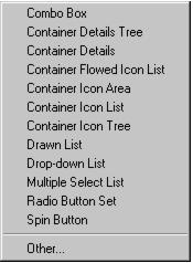
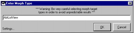
 Morph the currently selected parts into a different type. The morphing function is very powerful. Any primitive widget (or group of widgets) may be converted into an instance of any other primitive widget type. Composite widgets may also be converted into other composite widgets. Notebooks can be easily converted between Windows and OS/2 looks. Semantic validation is done on all attributes and connections. The morphing process will map over all attributes that the source and target types have in common. Attributes that don’t exist on the target will be dropped. Those that don’t exist on the source will be appropriately defaulted. Any invalid connections will be automatically dropped. The morphing operation is logged to the Transcript so that any lost attributes or connections are noted. The entire operation is completely undo/redo-able.
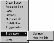
Be very careful with the Other... option as there is no guarantee that it will work for all combinations (for example, do not morph a primitive widget into a composite widget or vice versa). It is quite possible to leave the Composition Editor in an inconsistent state. Our advice is to use the Other... option cautiously and save your image in advance.
 Undo the last command. This is equivalent to the Composition Editor’s “Edit | Undo” menu command.
 Redo the last command. This is equivalent to the Composition Editor’s “Edit | Redo” menu command.
The style comboboxes are completely customizable. Right-click on either of them to get a popup menu of other style attributes specific to the selected widgets. Selecting a new attribute will update the combobox’s label and contents. If the first style combobox is changed, the second will adopt the style attribute formerly held by the first. Think of the two style comboboxes as showing you a window on a collection of attributes where the most important two will be displayed. By changing the attribute settings, you are essentially re-ordering the list and telling the UI Assistant what you think the most important attributes are. Any changes you make will be remembered so that the next time you select a widget of the same type, the two comboboxes will reflect the last settings that you made.