addedAt: position count: count
Item(s) were added to the collection of root items at the specified position. The position is specified as an index in the collection of root items only. Refresh the list.
Item(s) were added to the collection of root items at the specified position. The position is specified as an index in the collection of root items only. Refresh the list.
applicationDrawnBackground: aBoolean
Specifies whether the application wants the Draw Background Callback to fire when an item’s background needs to be drawn. If this value is false, then the widget will draw the normal default background for each selected and non-selected item.
Specifies whether the application wants the Draw Background Callback to fire when an item’s background needs to be drawn. If this value is false, then the widget will draw the normal default background for each selected and non-selected item.
atRow: row column: column
Answer the string that is at column@row. If there is no value, an empty string will be returned. If there are labels (or name) associated with a given row or column, the argument for that coordinate may be a string corresponding to the label (or column name). Example include: 1@'Name', 'Name'@1, 'Name'@'Year', 1@1
Answer the string that is at column@row. If there is no value, an empty string will be returned. If there are labels (or name) associated with a given row or column, the argument for that coordinate may be a string corresponding to the label (or column name). Example include: 1@'Name', 'Name'@1, 'Name'@'Year', 1@1
atRow: row column: column put: newValue
Set the value that is at column@row to newValue. If there are labels (or name) associated with a given row or column, the argument for that coordinate may be a string corresponding to the label (or column name). Example include: 1@'Name', 'Name'@1, 'Name'@'Year', 1@1
Set the value that is at column@row to newValue. If there are labels (or name) associated with a given row or column, the argument for that coordinate may be a string corresponding to the label (or column name). Example include: 1@'Name', 'Name'@1, 'Name'@'Year', 1@1
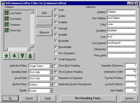
autosize: aBoolean
Specifies whether the autosizable columns should be autosized whenever the widget resizes.
Specifies whether the autosizable columns should be autosized whenever the widget resizes.
autoSizeColumnWidths
Autosize all of the autosizable columns
Autosize all of the autosizable columns
autoSizeColumnWidthsIfPossible
Autosize all of the autosizable columns if autosize is turned on
Autosize all of the autosizable columns if autosize is turned on
buttonPolicy: anInteger
Specifies how the hierarchy buttons should be displayed (e.g., as buttons, as triangles or not at all.
Specifies how the hierarchy buttons should be displayed (e.g., as buttons, as triangles or not at all.
deferRefreshWhile: aBlock
Minimize the repainting done while aBlock is being evaluated. This message may be safely nested. This message does not guarantee minimal repainting. Rather, it serves as a hint to the widget so that, where possible and appropriate, repainting can be deferred until the block has finished being evaluated.
Minimize the repainting done while aBlock is being evaluated. This message may be safely nested. This message does not guarantee minimal repainting. Rather, it serves as a hint to the widget so that, where possible and appropriate, repainting can be deferred until the block has finished being evaluated.
deleteAllItems
This message deletes all items from the list.
This message deletes all items from the list.
deletedAt: position count: count
Item(s) were deleted from the collection of root items at the specified position. The position is specified as an index in the collection of root items only. Refresh the list.
Item(s) were deleted from the collection of root items at the specified position. The position is specified as an index in the collection of root items only. Refresh the list.
deselectAllItems
Deselect and remove all elements from the selectedItems list. A selection callback is not triggered.
Deselect and remove all elements from the selectedItems list. A selection callback is not triggered.
deselectColumn: column
Deselect the column given. This message unhighlights the heading of the specified column.
Deselect the column given. This message unhighlights the heading of the specified column.
deselectItem: item
Deselect and remove the specified item from the selected list. A selection callback is not triggered.
Deselect and remove the specified item from the selected list. A selection callback is not triggered.
deselectPos: position
Deselect and remove an item from the selected list by position. A selection callback is not triggered.
Deselect and remove an item from the selected list by position. A selection callback is not triggered.
disabledSelector: aSymbol
Specifies selector sent to the row object to determine whether the row should be disabled.
Specifies selector sent to the row object to determine whether the row should be disabled.
expandCollapsePos: position notify: notify
Expand or collapse an item in the list by position to show or hide its children. If it is expanded, collapse it. If it is collapsed, expand it.
Expand or collapse an item in the list by position to show or hide its children. If it is expanded, collapse it. If it is collapsed, expand it.
getItemPos: position
Answer the item in the list by position. This message answers a list item at the specified position or nil if position is greater than the size of the list. This message only accesses the list if the item is not visible.
Answer the item in the list by position. This message answers a list item at the specified position or nil if position is greater than the size of the list. This message only accesses the list if the item is not visible.
getMatchPos: item
This message returns an Array of Integer positions where a specified item is found in the items list. If the item does not occur in the list the resulting Array is empty.
This message returns an Array of Integer positions where a specified item is found in the items list. If the item does not occur in the list the resulting Array is empty.
getSelectedPos
Return an Array containing the positions of every selected item in the list.
Return an Array containing the positions of every selected item in the list.
hasChildrenSelector: aSymbol
Set the unary selector sent to an item to return whether it has children.
Set the unary selector sent to an item to return whether it has children.
headingHeight: anInteger
Specifies the height, in pixels, of the table's heading row. If unspecified (i.e., a nil value), the heading height will be automatically calculated to be the height of the tallest heading cell value. This height does not include sizings for etching, the heading separator, or other margins.
Specifies the height, in pixels, of the table's heading row. If unspecified (i.e., a nil value), the heading height will be automatically calculated to be the height of the tallest heading cell value. This height does not include sizings for etching, the heading separator, or other margins.
headingSeparatorThickness: anInteger
Specifies the thickness of the horizontal line separating the column headings from the rest of the table.
Specifies the thickness of the horizontal line separating the column headings from the rest of the table.
hierarchyPolicy: resourceValue
Specifies how to display and manage the hierarchy. For more information about hierarchy policies, refer to EwHierarchy and its subclasses.
Specifies how to display and manage the hierarchy. For more information about hierarchy policies, refer to EwHierarchy and its subclasses.
indentationWidth: anInteger
Specifies how many pixels each level of the hierarchy should be indented.
Specifies how many pixels each level of the hierarchy should be indented.
indexAtPoint: aPoint
Answer the index of the item in the list which lies beneath the point given. If no item lies beneath the point or if the widget has not been drawn yet, then answer nil.
Answer the index of the item in the list which lies beneath the point given. If no item lies beneath the point or if the widget has not been drawn yet, then answer nil.
indexOf: item
Answer the index of the item given in the list or 0 if the item is not present in the list.
Answer the index of the item given in the list or 0 if the item is not present in the list.
initialStateSelector: aSymbol
Specifies a unary selector sent to an item to return its initial state (expanded or not).
Specifies a unary selector sent to an item to return its initial state (expanded or not).
isDisabled: item
Answer whether the item is disabled.
Answer whether the item is disabled.
isExpandedPos: position
Answer whether an item in the list by position is expanded to show its children.
Answer whether an item in the list by position is expanded to show its children.
itemAtPoint: aPoint
Answer the item in the list which lies beneath the point given.If no item lies beneath the point, then answer nil.
Answer the item in the list which lies beneath the point given.If no item lies beneath the point, then answer nil.
itemCount
Specifies the total number of items. This number might not match XmNitems, since this number is the size of the expanded hierarchy. It is automatically updated by the list whenever an element is added to or deleted from the list."
Specifies the total number of items. This number might not match XmNitems, since this number is the size of the expanded hierarchy. It is automatically updated by the list whenever an element is added to or deleted from the list."
itemHeight: anInteger
Specifies the height in pixels of items in the list. This includes the margin height on the top and bottom of the item as well as two pixels for emphasis.
Specifies the height in pixels of items in the list. This includes the margin height on the top and bottom of the item as well as two pixels for emphasis.
itemIsVisible: item
Check if a specified item is in the portion of the list that is currently visible. Answer true if it is even partially visible, false if it is not visible.
Check if a specified item is in the portion of the list that is currently visible. Answer true if it is even partially visible, false if it is not visible.
lockedColumns: anInteger
Specifies the number of columns to be locked down on the left side of the table. A column can be locked only if its preceding column is also locked. When scrolling, the locked columns remain fixed on the left side and all other columns scroll under the locked columns. This value must be no greater than the number of columns.
Specifies the number of columns to be locked down on the left side of the table. A column can be locked only if its preceding column is also locked. When scrolling, the locked columns remain fixed on the left side and all other columns scroll under the locked columns. This value must be no greater than the number of columns.
parentOfItem: anItem
Answer the parent of the item given in the hierarchy or false if it is not in the expanded hierarchy. Answer nil if it is a root item.
Answer the parent of the item given in the hierarchy or false if it is not in the expanded hierarchy. Answer nil if it is a root item.
refreshHierarchyPos: position
Refresh an item in the list by position. Also reobtain the item's children.
Refresh an item in the list by position. Also reobtain the item's children.
refreshNodeAt: position
Refresh the node at the given position. Answer whether or not a full refresh occurred.
Refresh the node at the given position. Answer whether or not a full refresh occurred.
reorderable: aBoolean
Specifies whether all of the columns should be reorderable (can be dragged left and right).
Specifies whether all of the columns should be reorderable (can be dragged left and right).
resizable: aBoolean
Specifies whether all of the columns should be resizable by the user. If so, the user can drag the right side of a column heading to change the column width.
Specifies whether all of the columns should be resizable by the user. If so, the user can drag the right side of a column heading to change the column width.
scrollHorizontal: aBoolean
This resource specifies whether a horizontal scroll bar should be used for the list.
This resource specifies whether a horizontal scroll bar should be used for the list.
selectableColumns: aBoolean
Defines whether the user may select columns by clicking on their headings.
Defines whether the user may select columns by clicking on their headings.
selectColumn: column
Select the column given. This message selects the heading of the specified column.
Select the column given. This message selects the heading of the specified column.
selectedIndex
Answer the index of the selected item
Answer the index of the selected item
selectedItem
Answer the item selected in the list.
Answer the item selected in the list.
selectedItemCount
Specifies the number of objects in the selected items list.
Specifies the number of objects in the selected items list.
selectedItems: anOrderedCollection
An OrderedCollection of Objects that represents the list items that are currently selected, either by the user or the application.
An OrderedCollection of Objects that represents the list items that are currently selected, either by the user or the application.
selectItem: item notify: notify
Select an item in the list. This message selects and adds the specified item to the current selected list. The cursor moves to the newly selected item.
Select an item in the list. This message selects and adds the specified item to the current selected list. The cursor moves to the newly selected item.
selectPos: position notify: notify
Select an item in the list by position. This message selects a list item at the specified position and adds it to the list of selected items.
Select an item in the list by position. This message selects a list item at the specified position and adds it to the list of selected items.
separatorsToExtremes: aBoolean
Defines whether row and column separators are to be extended to the extreme right and bottom edges of the table.
Defines whether row and column separators are to be extended to the extreme right and bottom edges of the table.
setBottomItem: item
Make the given item the last visible item in the list. The item can be any valid item in the list.
Make the given item the last visible item in the list. The item can be any valid item in the list.
setBottomPos: position
Make an item the last visible item in the list by position. This message makes the item at the specified position the last visible item in the list.
Make an item the last visible item in the list by position. This message makes the item at the specified position the last visible item in the list.
setFirstColumnPos: position
Make a column the first visible column by position. This message makes the column at the given position the first visible column. If this column is locked, this message has no effect. If there are locked columns and this column is not locked, then this column becomes the first column visible beyond the locked columns.
Make a column the first visible column by position. This message makes the column at the given position the first visible column. If this column is locked, this message has no effect. If there are locked columns and this column is not locked, then this column becomes the first column visible beyond the locked columns.
setItem: item
Make the given item the first visible item in the list. The item can be any valid item in the list.
Make the given item the first visible item in the list. The item can be any valid item in the list.
setLastColumnPos: position
Make a column the last visible column by position. This message makes the column at the given position the last visible column. If this column is locked, this message has no effect. If there are locked columns and this column is not locked, then this column becomes the last column visible.
Make a column the last visible column by position. This message makes the column at the given position the last visible column. If this column is locked, this message has no effect. If there are locked columns and this column is not locked, then this column becomes the last column visible.
setPos: position
Make an item the first visible item in the list by position. This message makes the item at the given position the first visible position in the list.
Make an item the first visible item in the list by position. This message makes the item at the given position the first visible position in the list.
topItemPosition: anInteger
Specifies the Integer position of the item that is the first visible item in the list.
Specifies the Integer position of the item that is the first visible item in the list.
visibleItemCount
Specifies the number of items that can fit in the visible space of the list. Until the list is realized, this answers 0.
Specifies the number of items that can fit in the visible space of the list. Until the list is realized, this answers 0.
Browse Selection Callback
These callbacks are triggered when an item is selected in the browse selection mode. It is only valid when Selection Policy is Browse Select.
These callbacks are triggered when an item is selected in the browse selection mode. It is only valid when Selection Policy is Browse Select.
Children Callback
These callbacks are triggered when an item’s list of children is needed.
These callbacks are triggered when an item’s list of children is needed.
Column Heading Selection Callback
These callbacks are triggered when a column heading is selected
These callbacks are triggered when a column heading is selected
Default Action Callback
These callbacks are triggered when an item is double clicked.
These callbacks are triggered when an item is double clicked.
Draw Background Callback
These callbacks are triggered when an item’s background needs to be drawn.
These callbacks are triggered when an item’s background needs to be drawn.
Expand Collapse Callback
These callbacks are triggered when an item is expanded or collapsed.
These callbacks are triggered when an item is expanded or collapsed.
Extended Selection Callback
These callbacks are triggered when items are selected using the extended selection mode. It is only valid when Selection Policy is Extended Select.
These callbacks are triggered when items are selected using the extended selection mode. It is only valid when Selection Policy is Extended Select.
Modify Verify Callback
These callbacks are triggered when the selection is about to be changed. The application may ‘undo’ the selection change by setting the doit field of the callData to false.
These callbacks are triggered when the selection is about to be changed. The application may ‘undo’ the selection change by setting the doit field of the callData to false.
Multiple Selection Callback
These callbacks are triggered when an item is selected in multiple selection mode. It is only valid when Selection Policy is Multiple Select.
These callbacks are triggered when an item is selected in multiple selection mode. It is only valid when Selection Policy is Multiple Select.
Single Selection Callback
These callbacks are triggered when an item is selected in single selection mode. It is only valid when Selection Policy is Single Select.
These callbacks are triggered when an item is selected in single selection mode. It is only valid when Selection Policy is Single Select.
Visual Info Callback
These callbacks are triggered when an item’s icon, label and isInUse are needed. The application MUST hook this callback and set the callData icon to the CgIcon (or other renderable object) to be displayed as the icon for the item in callData item. It must also set the callData label to the String (or other renderable object) to be displayed as the label for the item.
These callbacks are triggered when an item’s icon, label and isInUse are needed. The application MUST hook this callback and set the callData icon to the CgIcon (or other renderable object) to be displayed as the icon for the item in callData item. It must also set the callData label to the String (or other renderable object) to be displayed as the label for the item.
Application Drawn Background
Specifies whether the application wants the Draw Background Callback to fire when an item’s background needs to be drawn. If this value is false, then the widget will draw the normal default background for each selected and non-selected item.
Specifies whether the application wants the Draw Background Callback to fire when an item’s background needs to be drawn. If this value is false, then the widget will draw the normal default background for each selected and non-selected item.
Autosize
Specifies whether the autosizable columns should be autosized whenever the widget resizes.
Specifies whether the autosizable columns should be autosized whenever the widget resizes.
Button Policy
Specifies how the hierarchy buttons should be displayed (e.g., as buttons, as triangles or not at all.
Specifies how the hierarchy buttons should be displayed (e.g., as buttons, as triangles or not at all.
Border Width
Specifies the width of the border that surrounds the widget’s window on all four sides. The width is specified in pixels. A width of zero means that no border will show.
Specifies the width of the border that surrounds the widget’s window on all four sides. The width is specified in pixels. A width of zero means that no border will show.
Children Selector
Specifies a unary selector sent to an item to return its children.
Specifies a unary selector sent to an item to return its children.
Color Selector
Specifies a unary selector sent to an item to return its label color.
Specifies a unary selector sent to an item to return its label color.
Disabled Selector
Specifies selector sent to the row object to determine whether the row should be disabled.
Specifies selector sent to the row object to determine whether the row should be disabled.
Enabled
Determines whether a widget will react to input events. Disabled (insensitive) widgets do not react to input events.
Determines whether a widget will react to input events. Disabled (insensitive) widgets do not react to input events.
Has Children Selector
Specifies selector sent to the row object to determine whether it has children.
Specifies selector sent to the row object to determine whether it has children.
Heading Separator Thickness
Specifies the thickness of the horizontal line separating the column headings from the rest of the table.
Specifies the thickness of the horizontal line separating the column headings from the rest of the table.
Heading Visual Style
Defines the how the cells are displayed.
Defines the how the cells are displayed.
Icon Expand Selector
Specifies a unary selector sent to an item to return its expanded icon.
Specifies a unary selector sent to an item to return its expanded icon.
Icon Selector
Specifies a unary selector sent to an item to return its icon.
Specifies a unary selector sent to an item to return its icon.
Indentation Width
Specifies how many pixels each level of the hierarchy should be indented.
Specifies how many pixels each level of the hierarchy should be indented.
Initial State Selector
Specifies a unary selector sent to an item to return its initial state (expanded or not).
Specifies a unary selector sent to an item to return its initial state (expanded or not).
Item Height
Specifies the height in pixels of items in the list. This includes the margin height on the top and bottom of the item as well as two pixels for emphasis.
Specifies the height in pixels of items in the list. This includes the margin height on the top and bottom of the item as well as two pixels for emphasis.
Lines
Specifies whether the widget should display hierarchy lines.
Specifies whether the widget should display hierarchy lines.
Locked Columns
Specifies the number of columns to be locked down on the left side of the table. A column can be locked only if its preceding column is also locked. When scrolling, the locked columns remain fixed on the left side and all other columns scroll under the locked columns. This value must be no greater than the number of columns.
Specifies the number of columns to be locked down on the left side of the table. A column can be locked only if its preceding column is also locked. When scrolling, the locked columns remain fixed on the left side and all other columns scroll under the locked columns. This value must be no greater than the number of columns.
Row Separators
Specifies whether the rows are separated by a horizontal line.
Specifies whether the rows are separated by a horizontal line.
Scroll Horizontal
This resource specifies whether a horizontal scroll bar should be used for the list.
This resource specifies whether a horizontal scroll bar should be used for the list.
Selectable Columns
Defines whether the user may select columns by clicking on their headings.
Defines whether the user may select columns by clicking on their headings.
Selection Policy
Defines the interpretation of the selection action.
Defines the interpretation of the selection action.
Separators To Extremes
Defines whether row and column separators are to be extended to the extreme right and bottom edges of the table.
Defines whether row and column separators are to be extended to the extreme right and bottom edges of the table.
Set Heading Font
Specifies the font list associated with the headings.
Specifies the font list associated with the headings.
Show Column Heading
Specifies whether the column heading should be displayed.
Specifies whether the column heading should be displayed.
Show Row Heading
Specifies whether the row heading should be displayed.
Specifies whether the row heading should be displayed.
Sortable
Specifies whether all of the columns should be sortable.
Specifies whether all of the columns should be sortable.
Top Item Position
Specifies the Integer position of the item that is the first visible item in the list.
Specifies the Integer position of the item that is the first visible item in the list.
Visible
Maps the widget (makes visible) as soon as it is both realized and managed, if set to True. If set to False, the client is responsible for mapping and unmapping the widget.
Maps the widget (makes visible) as soon as it is both realized and managed, if set to True. If set to False, the client is responsible for mapping and unmapping the widget.
Visual Style
Defines the how the cells are displayed.
Defines the how the cells are displayed.
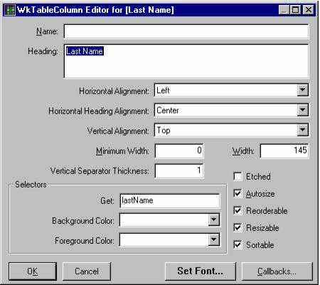
Autosize
Specifies whether the column width should be autosized.
Specifies whether the column width should be autosized.
Background Color
Specifies selector sent to the row object to retrieve the background color for the cell. The color may also be hardcoded.
Specifies selector sent to the row object to retrieve the background color for the cell. The color may also be hardcoded.
Callbacks
Launches the Callback Editor on the edited column.
Launches the Callback Editor on the edited column.
Etched
Specifies whether this column is to be etched.
Specifies whether this column is to be etched.
Foreground Color
Specifies selector sent to the row object to retrieve the foreground color for the cell. The color may also be hardcoded.
Specifies selector sent to the row object to retrieve the foreground color for the cell. The color may also be hardcoded.
Get Selector
Specifies selector sent to the row object to retrieve the data for the cell.
Specifies selector sent to the row object to retrieve the data for the cell.
Heading
Specifies the heading object to be displayed at the top of the column.
Specifies the heading object to be displayed at the top of the column.
Horizontal Alignment
Specifies how the cells in this column should be aligned horizontally.
Specifies how the cells in this column should be aligned horizontally.
Horizontal Heading Alignment
Specifies how this column’s heading should be aligned horizontally.
Specifies how this column’s heading should be aligned horizontally.
List Selector
Specifies selector sent to the row object to retrieve a list of values to populate the drop down list in the cell.
Specifies selector sent to the row object to retrieve a list of values to populate the drop down list in the cell.
Minimum Width
Specifies the minimum width of the column in pixels. This minimum applies to autosizing and user resizing operations.
Specifies the minimum width of the column in pixels. This minimum applies to autosizing and user resizing operations.
Name
Specifies the name of the column. This name may be used to programmatically access the column. Note that this is distinct from the heading of the column.
Specifies the name of the column. This name may be used to programmatically access the column. Note that this is distinct from the heading of the column.
Reorderable
Specifies whether the column is reorderable (can be dragged left and right).
Specifies whether the column is reorderable (can be dragged left and right).
Resizable
Specifies whether the column is resizable by the user. If so, the user can drag the right side of the column heading to change the column width
Specifies whether the column is resizable by the user. If so, the user can drag the right side of the column heading to change the column width
Set Font
Set the font for the edited column.
Set the font for the edited column.
Sortable
Specifies whether the column is sortable.
Specifies whether the column is sortable.
Vertical Alignment
Specifies how the cells and heading in this column should be aligned vertically.
Specifies how the cells and heading in this column should be aligned vertically.
Vertical Separator Thickness
Specifies the thickness of the line shown to the right of each cell in the column.
Specifies the thickness of the line shown to the right of each cell in the column.
Width
Specifies the width of the column in pixels. This does not includes the width of any emphasis or vertical separator.
Specifies the width of the column in pixels. This does not includes the width of any emphasis or vertical separator.